Saturday 23 January 2016

Collapsible Toolbar Helper


Collapsible-Toolbar-Helper


A combination of custom CollapsibleToolbar and Collapsing Text to give you the same effect as App Bar Layout from the Desgin support library sans the use of a Toolbar

ScreenShot


Screenshot

BACKGROUND :


CollapsibleToolbarHelper :

Although the new design support library allows us to do some cool stuff, the available sample code does not cover the potential that it has been built for. Most of the samples that I came across, including the cheese square example by Chris Banes, create the application so that minimum code has to be written.
But what if I want a different layout and implementation? My main requirement was that I did NOT require a Toolbar for my design. When going through the AOSP code for CollapsibleTollbarLayout in the design support library, I realized that it has a tight integration with the Toolbar. So, Initially, I decided to work around that. There are a very few blogs out there that actually go deep into the actual potential of the CollapsibleToolbarLayout.
Few of them are listed below:
  1. Thanks Grzesiek Gajewski
  2. Thanks Saul Molinero
  3. Thanks Rafa Vazquez
In a nutshell, it all boils down to a few things:
  1. Coordinator Layout controls the "behavior" of its children which implement CoordinatoLayout.Behavior Check out NestedScrollView "Behavior" or AppBarLayout "Behavior" or FAB "Behavior" for implementations
  2. AppBarLayout calls on a OnOffsetChangedListener implementation when it scrolls,
    which can be used to do stuff. Check out OnOffsetChangedListener in CollapsingToolbarLayout
Well, that was my premise of creating the CollapsibleToolbarHelper. It of course is derived heavily from the AOSP code, but with a few modifications. It supports the following collapse modes: - MOVE_ON_SCROLL = The children move when the collapsible toolbar collapses to hit the bottom of that view - PARALLAX_ON_SCROLL = THe usual parallax, move and then hide when the Toolbar collapses - PIN_ON_SCROLL = Stays at the position where it is laid out originally - HIDE_ON_COLLAPSE = Stays at its location and hides when the toolbar is collapsed - SHOW_ON_COLLAPSE = Is hidden at the location that it is supposed to and appears after the Toolbar has collapsed Note that it has to be used as a direct child of AppBarLayout since it depends on the OffsetChangedListener of the AppBarLayout to collapse and expand.

CollapsibleTextLayout :

Since I was designing the CollapsibleToolbar, I required a CollapsibleText as well. But the default CollapsibleTextHelper is coupled too tightly with the CollapsingToolbarLayout and not public to be modified. So, taking inspirations from AOSP, Chris banes' Philm and Nick Butchers Plaid, I wrote my own CollapsingTextlayout.
I know that there is a lot of room for improvement and that there are obvious optimizations and feature enhancements, but the main objective of re-writing these widgets was learning. I have collected all the ideas from the given references and tried to simplify the implementation as much as possible. The code is commented and should be self explanatory.
Interested? Well go ahead, download and use the widgets.

Usage

<android.support.design.widget.CoordinatorLayout
    xmlns:android="http://schemas.android.com/apk/res/android"
    xmlns:app="http://schemas.android.com/apk/res-auto"
    android:layout_width="match_parent"
    android:layout_height="match_parent"
    android:fitsSystemWindows="true">

    <android.support.design.widget.AppBarLayout
        android:id="@+id/app_bar"
        android:layout_width="match_parent"
        android:layout_height="wrap_content"
        android:paddingTop="5dp"
        android:paddingBottom="30dp"
        android:theme="@style/AppTheme.AppBarOverlay"
        >

        <abysmel.com.collapsibletoolbarhelper.widgets.CollapsibleToolbarHelper
            android:id="@+id/toolbar_layout"
            android:layout_width="match_parent"
            android:layout_height="match_parent"
            app:layout_scrollFlags="scroll|exitUntilCollapsed"
            android:gravity="center_vertical"
            android:layout_marginTop="10dp"
            android:background="@android:color/transparent"
            >

            <!--Note that the position has to be set with respect to the collapsed toolbar. So,
                aligning it in center initially (centerInParent="true") will NOT work as it will remain
                at its position even after the Toolbar collapses. Also note that the initially set the
                alpha of the view to zero and NOT the visibility to gone, as the view will then have never
                been drawn which will throw all calculations haywire for show_on_collapse. Wish there
                was a better way to do this-->
            <ImageView
                android:layout_width="wrap_content"
                android:layout_height="wrap_content"
                android:id="@+id/hello.img"
                android:src="@mipmap/hello"
                android:layout_marginLeft="10dp"
                android:alpha="0"
                app:layout_marginTopPercent = "3%"
                app:collapseMode="show_on_collapse"/>

            <!-- Title -->
            <abysmel.com.collapsibletoolbarhelper.widgets.CollapsibleTextLayout
                android:id="@+id/hello.text"
                android:layout_height="wrap_content"
                android:layout_width="wrap_content"
                app:layout_widthPercent="59%"
                android:layout_alignParentLeft="true"
                app:layout_marginTopPercent = "1%"
                app:layout_marginBottomPercent = "1%"
                app:layout_marginLeftPercent="5%"
                android:textColor="@android:color/white"
                app:collapseMode="pin_on_scroll"
                app:textToShow = "Hello World"
                app:expandedTextColor = "@android:color/white"
                app:collapsedTextColor = "@android:color/white"
                app:typefaceFamilyPrimary = "sans-serif-light"
                app:typefaceFamilySecondary = "sans-serif-medium"
                app:isMultiFaceted="true"
                app:typefaceSplitPosition="5"
                app:expandedTextSize = "62dp"
                app:collapsedTextSize = "32dp"
                app:maxExpandedTextSize = "62dp"
                />

            <!-- The hello number edit button -->
            <ImageView
                android:id="@+id/hello.edit"
                android:layout_width="wrap_content"
                android:layout_height="wrap_content"
                android:layout_alignParentRight="true"
                app:layout_marginTopPercent = "3%"
                app:layout_marginBottomPercent = "1%"
                app:layout_marginRightPercent = "4%"
                android:layout_marginLeft="10dp"
                android:src="@mipmap/pencil"
                app:collapseMode="hide_on_collapse"/>

            <!-- The hello Number -->
            <TextView
                android:id="@+id/hello.number"
                android:layout_height="wrap_content"
                android:layout_width="wrap_content"
                app:layout_widthPercent="40%"
                app:layout_marginTopPercent = "1%"
                app:layout_marginBottomPercent = "1%"
                app:layout_marginRightPercent = "1%"
                android:layout_toLeftOf="@id/hello.edit"
                android:layout_toRightOf="@id/hello.text"
                android:gravity="end"
                android:text="@string/hello_no_sign"
                android:textColor="@android:color/white"
                android:textSize="@dimen/hello_no_size"
                app:collapseMode="pin_on_scroll"/>


            <!-- Version -->
            <TextView
                android:id="@+id/version"
                app:layout_widthPercent="40%"
                android:layout_height="wrap_content"
                android:layout_width="wrap_content"
                android:layout_below="@id/hello.text"
                android:layout_marginTop="5dp"
                android:layout_alignParentLeft="true"
                app:layout_marginLeftPercent="5%"
                android:text="@string/version"
                android:textColor="@android:color/white"
                android:textSize="@dimen/version_no_size"
                app:collapseMode="parallax_on_scroll"
                 />

            <!-- E-mail Address -->
            <TextView
                android:id="@+id/hello.address"
                app:layout_widthPercent="40%"
                android:layout_height="wrap_content"
                android:layout_width="wrap_content"
                android:layout_below="@id/hello.number"
                android:layout_alignParentRight="true"
                android:gravity="end"
                app:layout_marginRightPercent="5%"
                android:text="@string/emailaddress"
                android:textColor="@android:color/white"
                android:textSize="@dimen/mail_address_size"
                app:collapseMode="parallax_on_scroll"
                 />
        </abysmel.com.collapsibletoolbarhelper.widgets.CollapsibleToolbarHelper>
    </android.support.design.widget.AppBarLayout>
</android.support.design.widget.CoordinatorLayout>

uCrop - Image Cropping Library for Android

uCrop - Image Cropping Library for Android

This project aims to provide an ultimate and flexible image cropping experience.

alt text

Usage

  1. Include the library as local library project.
    compile 'com.yalantis:ucrop:1.0.1'
  2. Add UCropActivity into your AndroidManifest.xml
    <activity
        android:name="com.yalantis.ucrop.UCropActivity"
        android:screenOrientation="portrait"/>
    
  3. The uCrop configuration is created using the builder pattern.
    UCrop.of(sourceUri, destinationUri)
        .withAspectRatio(16, 9)
        .withMaxResultSize(maxWidth, maxHeight)
        .start(context);
  4. Override onActivityResult method and handle uCrop result.
    @Override
    public void onActivityResult(int requestCode, int resultCode, Intent data) {
        if (resultCode == RESULT_OK && requestCode == UCrop.REQUEST_CROP) {
            final Uri resultUri = UCrop.getOutput(data);
        } else if (resultCode == UCrop.RESULT_ERROR) {
            final Throwable cropError = UCrop.getError(data);
        }
    }

Customization

If you want to let your users choose crop ratio dynamically, just do not call withAspectRatio(x, y).
uCrop builder class has method withOptions(UCrop.Options option) which extends library configurations.
Currently you can change:
  • image compression format (e.g. PNG, JPEG, WEBP), compression
  • image compression quality [0 - 100]. PNG which is lossless, will ignore the quality setting.
  • whether all gestures are enabled simultaneously
  • maximum size for Bitmap that is decoded from source Uri and used within crop view. If you want to override default behaviour.
  • more coming... (e.g. color pallet)

Compatibility

  • Library - Android GINGERBREAD 2.3+
  • Sample - Android ICS 4.0+

Friday 22 January 2016

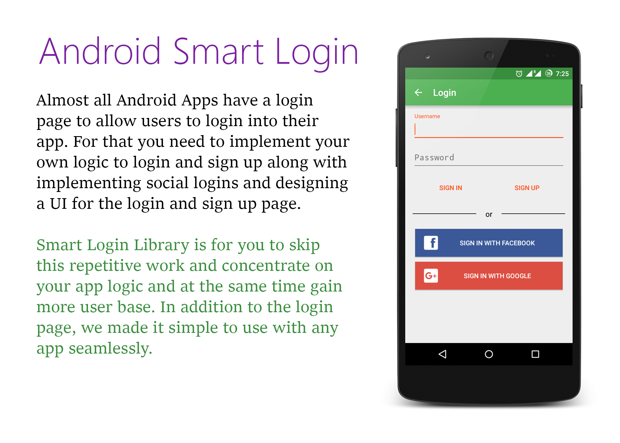
Android Smart Login

What's in the box

  • A material designed login page
  • Implementation of Facebook and Google login
  • Easy way to implement custom login and sign up
  • Smart and easy way to apply the flow with SmartUser
  • Customizable login screen (more customization will be available in upcoming versions)

Setup

1. Get the library from here

Since it's in beta, decided not to put it in Maven Central. Will provide the gradle dependency from the first release. So for now please add the library as a module to your project.

2. Add the AAR as a module dependency to your app.

You can do this by clicking File -> New -> New Module... Then choose "Import .JAR/.AAR package" option and the add the downloaded aar file as a dependency. You need to compile this newly added module. This can be done by adding this line in your dependencies of your app/build.gradle
    compile project(':smartloginlibrary-v0.5beta')
Since we implemented Facebook and Google login for you, it is necessary to add the following dependencies in yourapp/build.gradle
    //Support libraries
    compile 'com.android.support:appcompat-v7:23.0.1'
    compile 'com.android.support:design:23.0.1'
    //Facebook SDK
    compile 'com.facebook.android:facebook-android-sdk:4.0.1'
    //Google Play Services
    compile 'com.google.android.gms:play-services:8.1.0'
    //GSON library
    compile 'com.google.code.gson:gson:2.3.1'
We used
  • Support Library for maintaining compatibily of material design
  • Facebook SDK and Google Play Services are necessary as we implemented social logins
  • GSON library is must for now as we used it to set user sessions

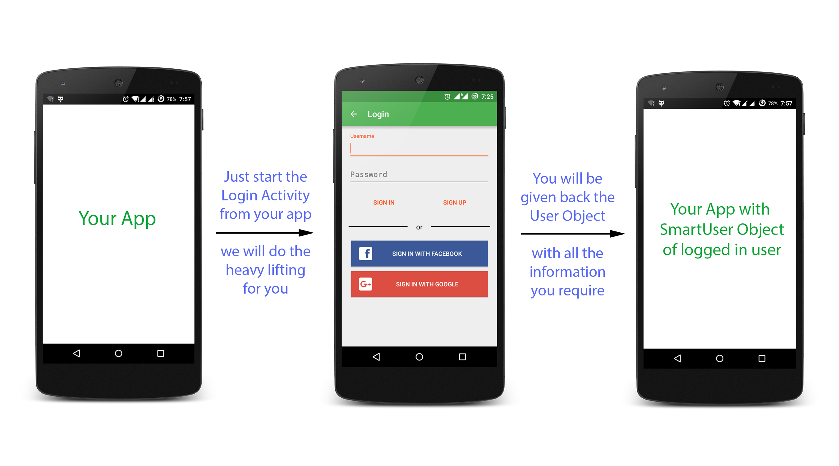
3. Start the LoginActivity

First instantiate the SmartLoginBuilder and the using the created object build the Intent to invoke the login page.
    SmartLoginBuilder loginBuilder = new SmartLoginBuilder();
    Intent intent = loginBuilder.with(context)
                        .setAppLogo(APP_LOGO)
                        .isFacebookLoginEnabled(true).withFacebookAppId("APP_ID")
                        .withFacebookPermissions(PERMISSIONS)
                        .isGoogleLoginEnabled(true)
                        .build();
    startActivityForResult(intent, SmartLoginConfig.LOGIN_REQUEST);
Don't forget to add the following in the manifest
    <uses-permission android:name="android.permission.INTERNET"/>
    <!-- Required for Google Login -->
    <uses-permission android:name="android.permission.GET_ACCOUNTS" />
    <uses-permission android:name="android.permission.USE_CREDENTIALS" />
    <!-- In application tag (Need to register the Login activity in your app) -->
    <activity
            android:name="studios.codelight.smartloginlibrary.SmartLoginActivity"
            android:theme="@style/AppTheme" />
    <activity android:name="com.facebook.FacebookActivity"
            android:configChanges=
                "keyboard|keyboardHidden|screenLayout|screenSize|orientation"
            android:theme="@android:style/Theme.Translucent.NoTitleBar"
            android:label="@string/app_name" />
Config
  • APP_LOGO - Integer - Optional - Send your logo to display on the login page.
    Facebook Login setup
  • APP_ID - String - Needed if Facebook login is enabled - App ID of your app on facebook
  • PERMISSIONS - ArrayList - Needed if Facebook login is enabled (if not specified these Default Permissions are taken). Learn more about Facebook Login Permissions.
    Google Login setup
  • Just enable Google login by passing true to isGoogleLoginEnabled method
  • Before that, you need to configure your app in Google Developers Console and get the Configuration File. Learn more about Google sign in
  • Place the configuration file in the app/ directory and that's it.

4. Get back the logged in User

From the intent that you passed, Login Activity will be started. Based on user interaction, it will send back the result code along with SmartUser object(if login is successful). Hence you can catch the SmartUser object in onActivityResult method
For example
    @Override
    protected void onActivityResult(int requestCode, int resultCode, Intent data) {
        //Intent "data" contains the user object
        if(resultCode == SmartLoginConfig.FACEBOOK_LOGIN_REQUEST){
            SmartFacebookUser user;
            try {
                user = data.getParcelableExtra(SmartLoginConfig.USER);
                //use this user object as per your requirement
            }catch (Exception e){
                Log.e(getClass().getSimpleName(), e.getMessage());
            }
        }else if(resultCode == SmartLoginConfig.GOOGLE_LOGIN_REQUEST){
            SmartGoogleUser user;
            try {
                user = data.getParcelableExtra(SmartLoginConfig.USER);
                //use this user object as per your requirement
            }catch (Exception e){
                Log.e(getClass().getSimpleName(), e.getMessage());
            }
        }else if(resultCode == SmartLoginConfig.CUSTOM_LOGIN_REQUEST){
            SmartUser user = data.getParcelableExtra(SmartLoginConfig.USER);
            //use this user object as per your requirement
        }else if(resultCode == RESULT_CANCELED){
            //Login Failed
        }
    }
VoilĂ ! That's it. You now have the entire user login functionality in your app

5. Implementing custom user login and sign up

Get more out of the library by easily implementing your logic to login and sign up the users. For this, all you need to do is implement the following code:
        SmartCustomLoginListener loginListener = new SmartCustomLoginListener() {
            @Override
            public boolean customSignin(SmartUser smartUser) {
                //do something with smartUser
                if(SUCCESS){
                    return true;
                } else {
                    return false;
                }
            }

            @Override
            public boolean customSignup(SmartUser smartUser) {
                //do something with smartUser
                if(SUCCESS){
                    return true;
                } else {
                    return false;
                }
            }

            @Override
            public boolean customUserSignout(SmartUser smartUser) {
                //do something with smartUser
                if(SUCCESS){
                    return true;
                } else {
                    return false;
                }
            }
        };
Next pass that loginListener into setSmartCustomLoginHelper method of loginBuilder
Intent intent = loginBuilder.with(context)
        .isCustomLoginEnabled(true).setSmartCustomLoginHelper(loginListener)
        .build();
startActivityForResult(intent, SmartLoginConfig.LOGIN_REQUEST);

How it works

Image

Other Features

Get the current logged in user at anytime from your application by just calling UserSessionManager.getCurrentUsermethod
SmartUser currentUser = UserSessionManager.getCurrentUser(context);
if(currentUser != null){
    //You have got what you need
}

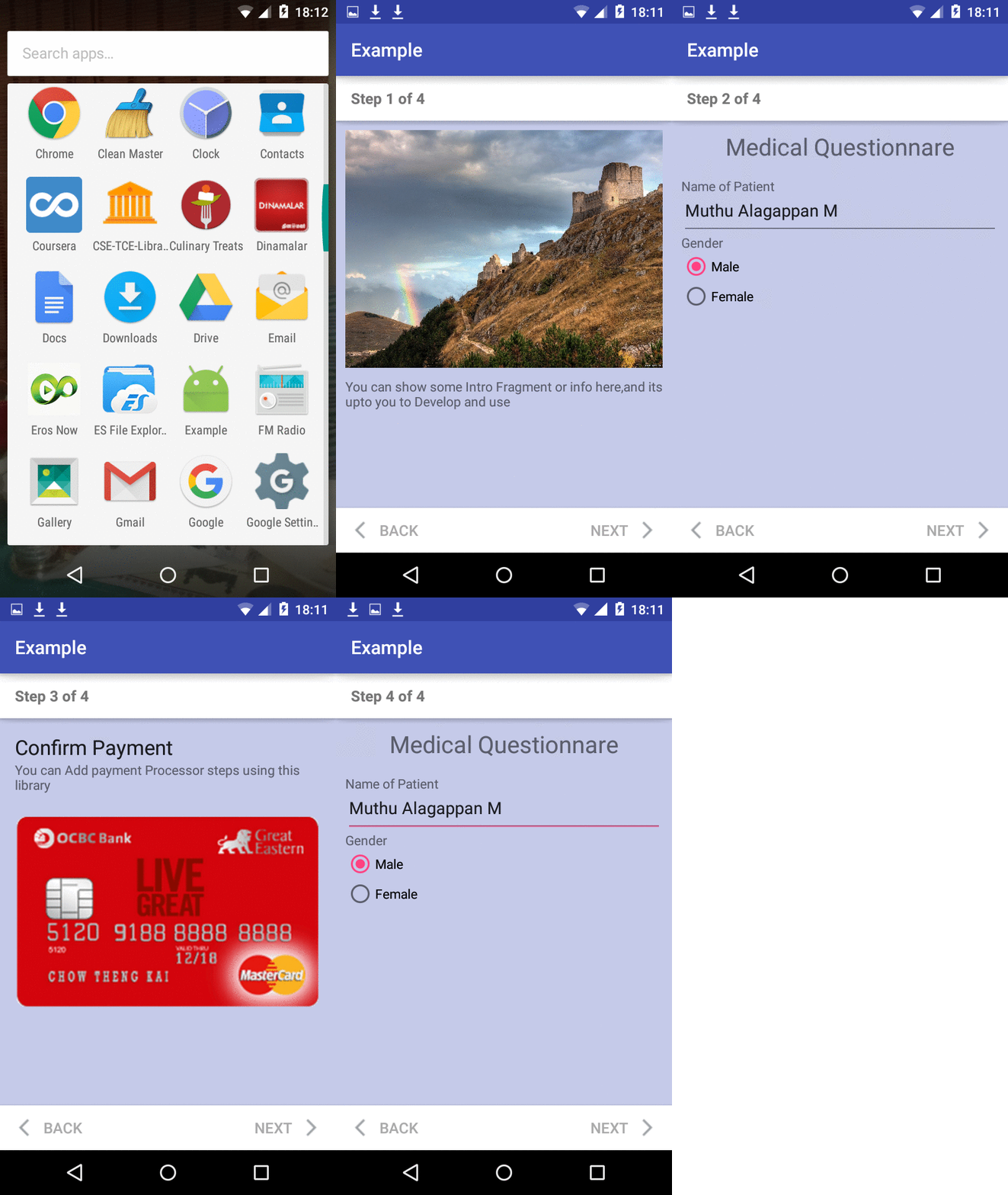
Material Design Steppers

Material Design Steppers

Google Material Design Steppers Component 

compile 'ivb.com.materialstepper:material-stepper:0.0.2'
Steps to Add To your Project :
  1. Download the library (i have added to jcenter and waiting for approval) or add in your libs folder
  2. Extend your Activity -> from mobileStepperSimple Class
  3. Implement the Methods initApp and onStepperCompleted
  4. Basically Every Steps will be Fragments and will be handling UserInteraction,so create,Extend your fragments fromstepperFragment
  5. Implement the Method onNextButtonHandler which should return true/false to determine the Library to Move Ahead for next Step,So write your UI validations here and return appropriately.
  6. In your Activity create Objects for your fragments made with stepperFragment ,create as many fragments for your use
  7. Create List and add all the object of fragments.
  8. Inside your initApp overriden Method, just setFragments(PASS_LIST_OF_FRAGMENTS)
  9. >
  10. finally call init() method from your initApp() method
  11. Use onStepperCompleted() for taking actions after the Stepper fragments are completely done by the user
Note : with the given List size : step count will be Computed and Updated,Increasing and dynamic fragment feature will be added in future Commits, Scrollview have been adopted for fragment inbuilt to scroll,So no worries for small screens and large layout.

DEMO :

Included the Example Demo app in Example Medical App project,Download and Sync with gradle.build
Screenshot :

demo screenshot 

Use of this Library :

  1. Payment Processing Steps for Checkouts
  2. Account verification and creation
  3. Survey Apps and Form fillup driven apps (Highly Recommended)
  4. Any Accomplishment apps and Task driven apps.

Android Percent Progress Bar

Android Percent ProgressBar

Inspired by NumberProgressBar, this is Android-PercentProgressBar, CircularProgressBar and LineProgressBar with progress percentage shown. 

Use

It is very easy to use, to integrate and to customize PercentProgressBar. Demo is available here:https://github.com/natasam/DemoPercentProgressBar
example0 example1example2example3